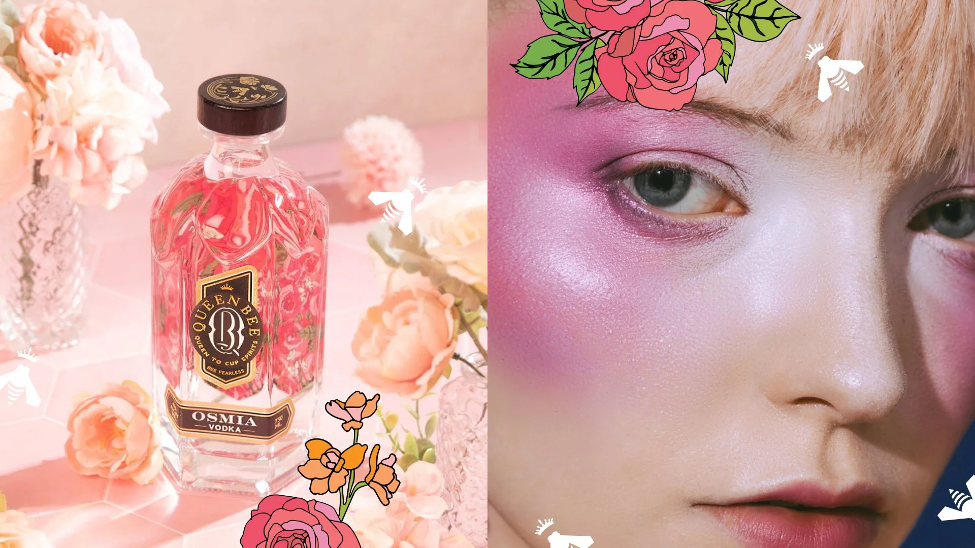
Queen Bee Osmia Vodka
Queen to Cup Spirits, uncompromising quality and taste in every beautiful sip.
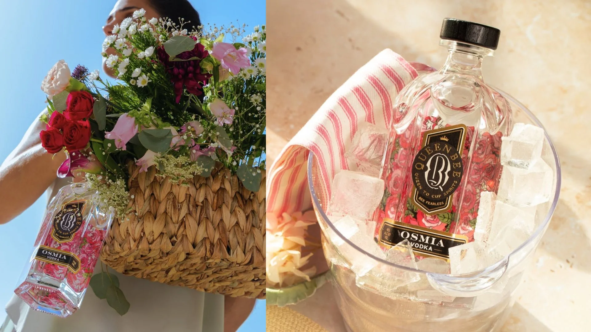
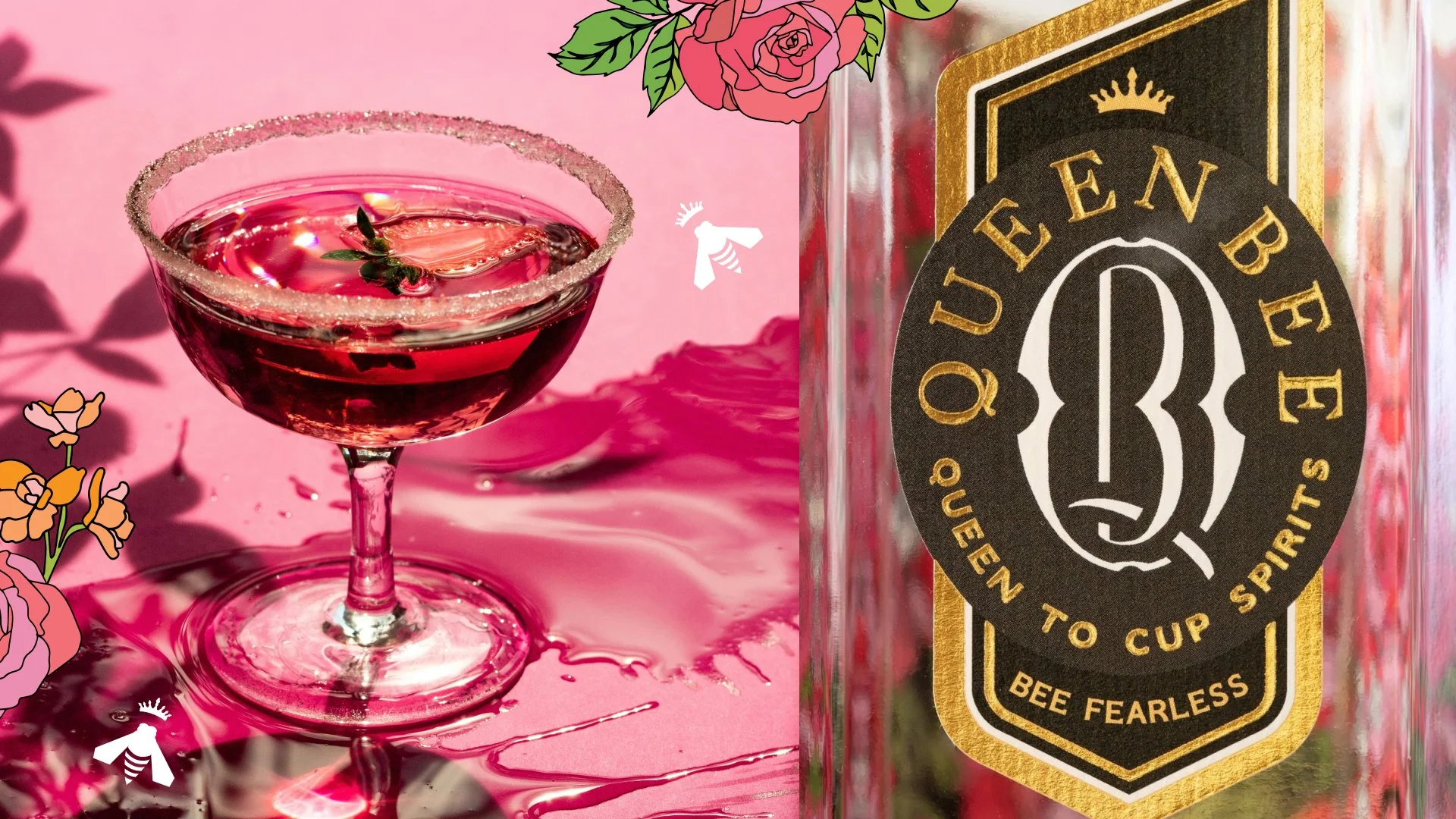
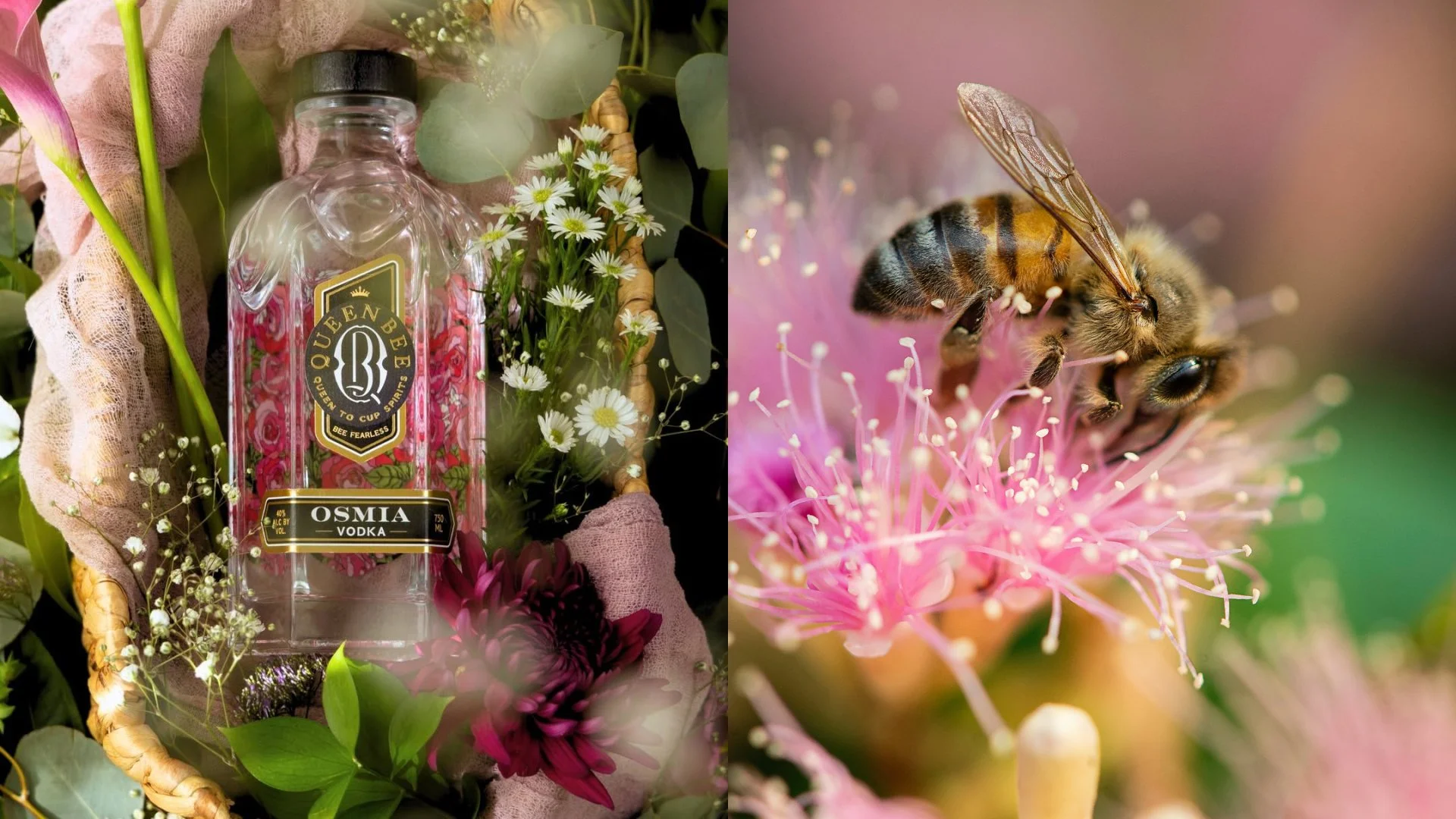
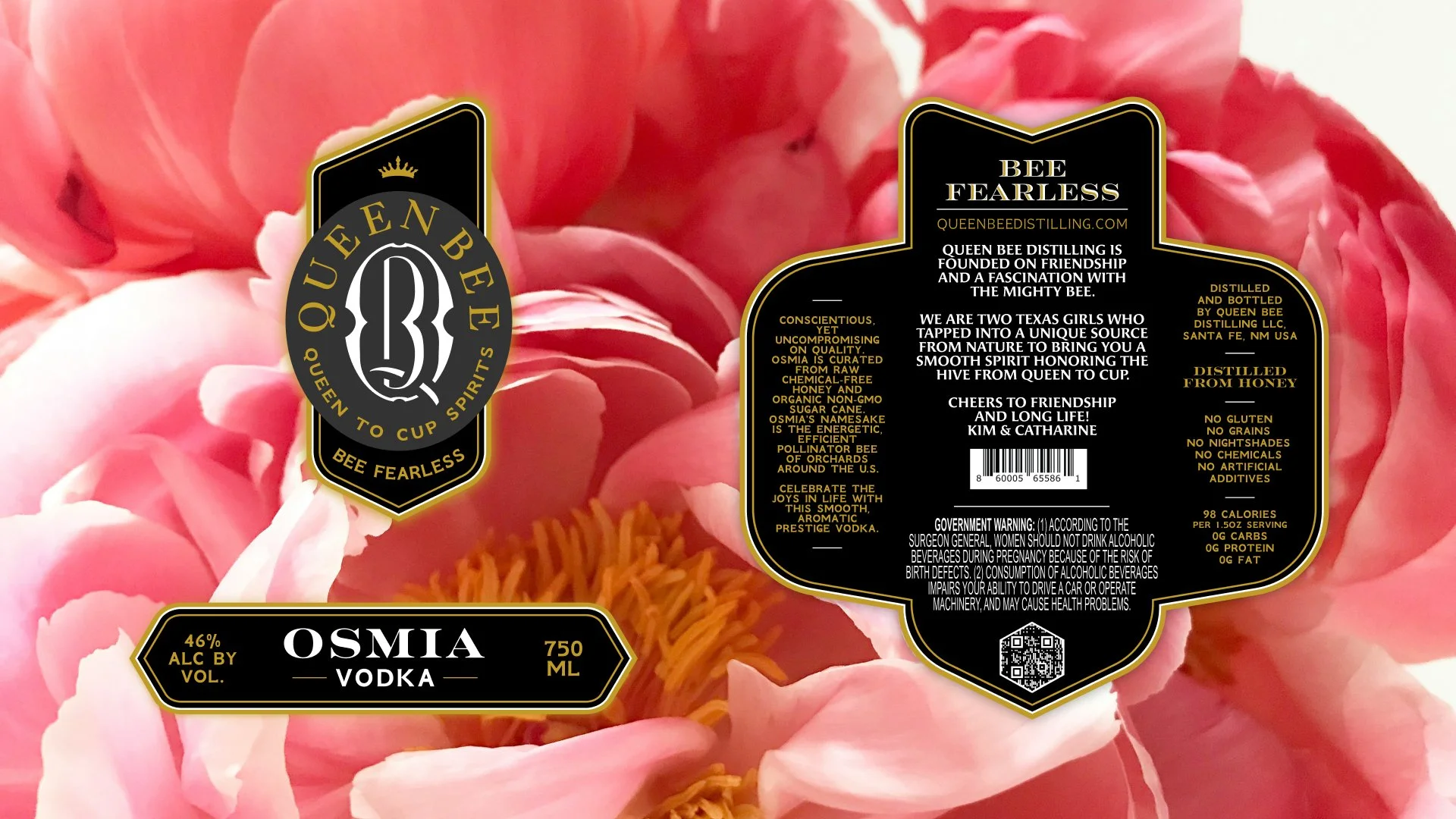
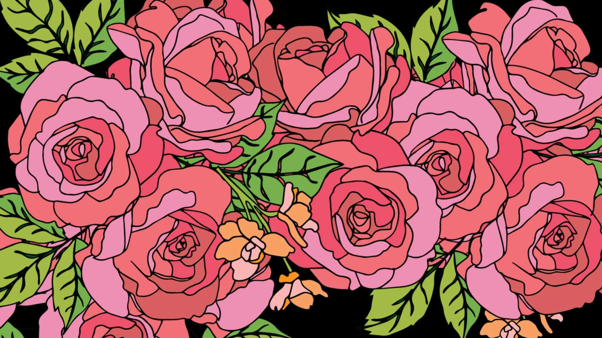
Working in partnership with High Proof Creative, an independent agency specializing in craft spirit marketing, together with Queen Bee Distilling’s founders Kim and Catharine, we took their existing logo concept and created a beautiful and dynamic label design for their first product launch: Osmia Vodka. . The front label is delicate and guilded, allowing for their unique floral bottle shape to shine, while the back label structure is inspired by the shape of a bee— a fully custom dieline I created to fold over 3 of the 6 panels on the hexagonal bottle. The back label is two sided, allowing for a vibrant and fully custom illustrated pattern of roses and florals to be shown through the bottle’s front panel.
A beautiful labor of love, now winning awards for it’s category, both in spirit quality and in packaging design.
AWARDS:
GOLD 🥇 , 2025 American Craft Spirits Competition
SILVER 🥈, 2025 Craft Spirits Packaging Awards
GOLD 🥇 , 2024 International Spirits Competition Packaging Excellence
BEST OF CATEGORY , 2024 International Spirits Competition Packaging Excellence